
TeleMadrid rebrand
Branding & TV Image, FeaturedTeleMadrid rebrand

The star as a key visual and movement axis
#TVimage #animation
Evolution or revolution?
This was the key question when we partnered with Mucho on this branding project for TeleMadrid. We strongly believe in building on heritage when the graphic foundations of a brand identity are solid.
We quickly realized that the star was the hero of the previous logo and that was the starting point. The star in the logo is the star of the autonomic flag. We wanted to highlight that link and take it one step further. We wanted Madrileños to be the real stars of this new chapter in TeleMadrid. So we placed the star at the center of the graphic language. The challenge was to bring back TeleMadrid as the reference media outlet for everybody in the community. The values TeleMadrid had to embrace should be visible in the Brand communication. It needed to be open, relatable and closer to the audience, interactive and inviting. Besides, it had to evolve into a transmedia Brand. The language needed to be digital and flexible. The final objective was to make Telemadrid the channel where all madileños could relate to.
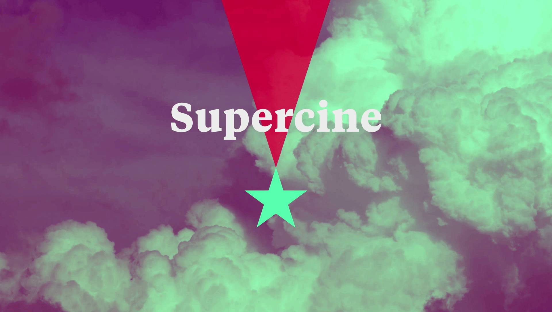
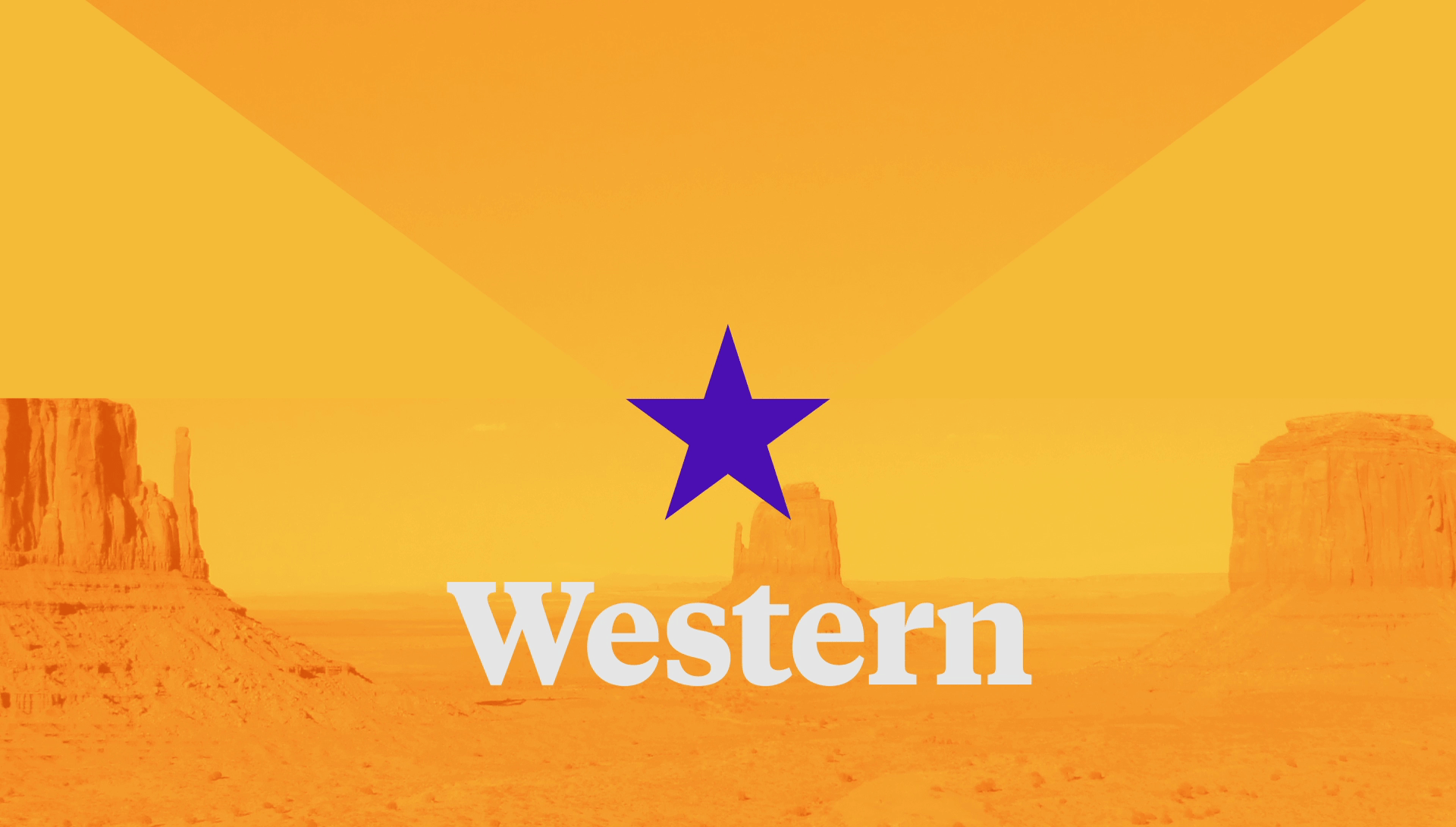
In the new graphic language, all three brands share the star, but everyone has its own personality.
TeleMadrid aims to unite all Madileños, so the arrows point at the centre. LaOtra has a younger and more dynamic personality. Whilst OndaMadrid is expansive as the radio waves.
We also changed the way the colour is used by moving it to the background thus making it more recognisable. Plus, we gave them a more current and digital feel. The red, which will be used when no other colour is possible, is the same red as of the flag of Madrid.

The new TeleMadrid is rooted in strong journalism values and news is key to the new direction.
Tiempos typography is designed for newspapers and gives the brand a sense of purpose.
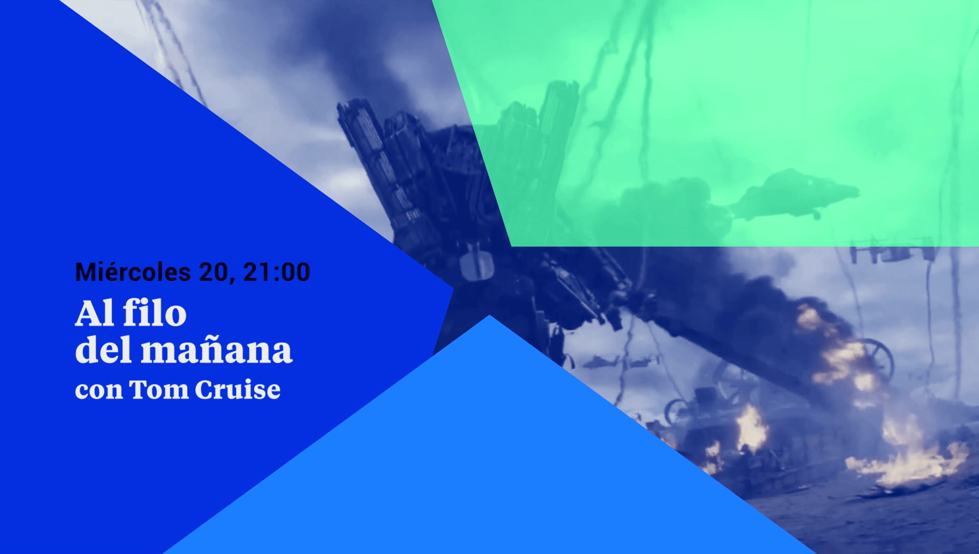
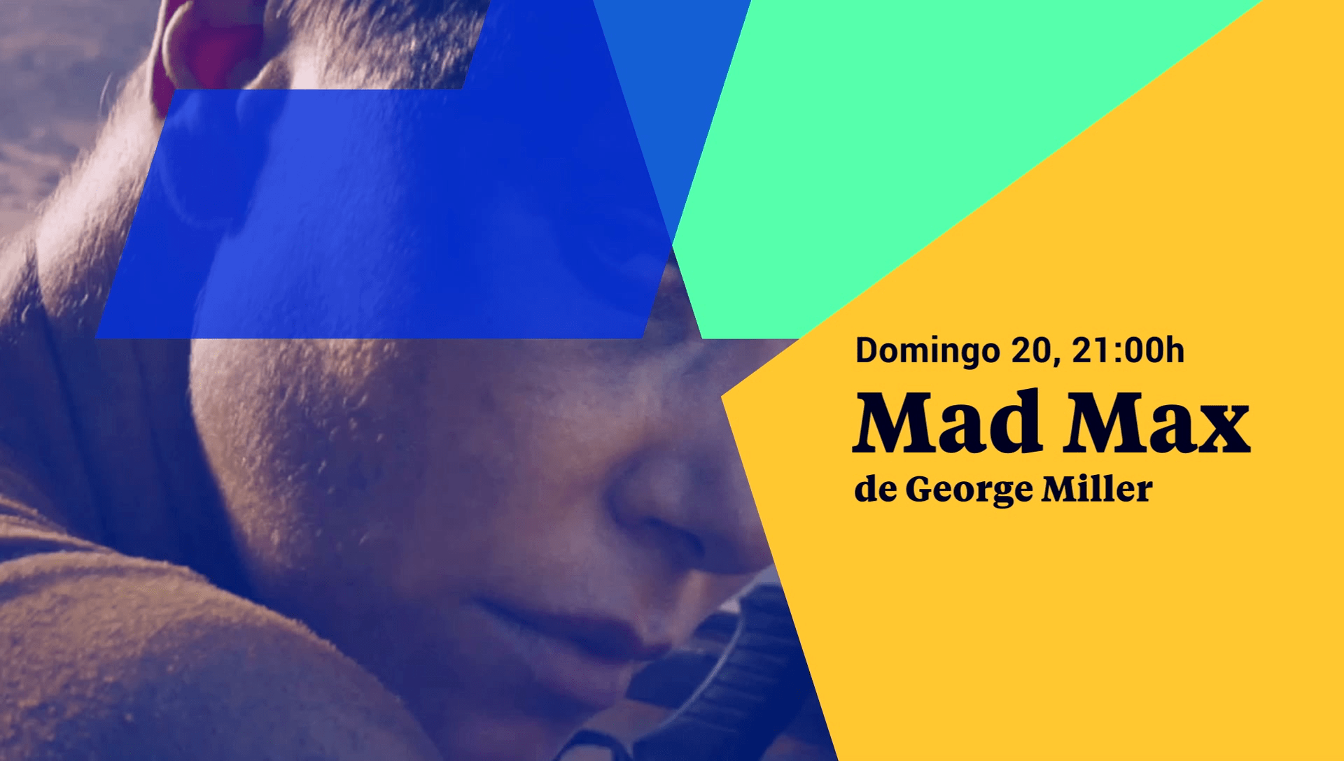
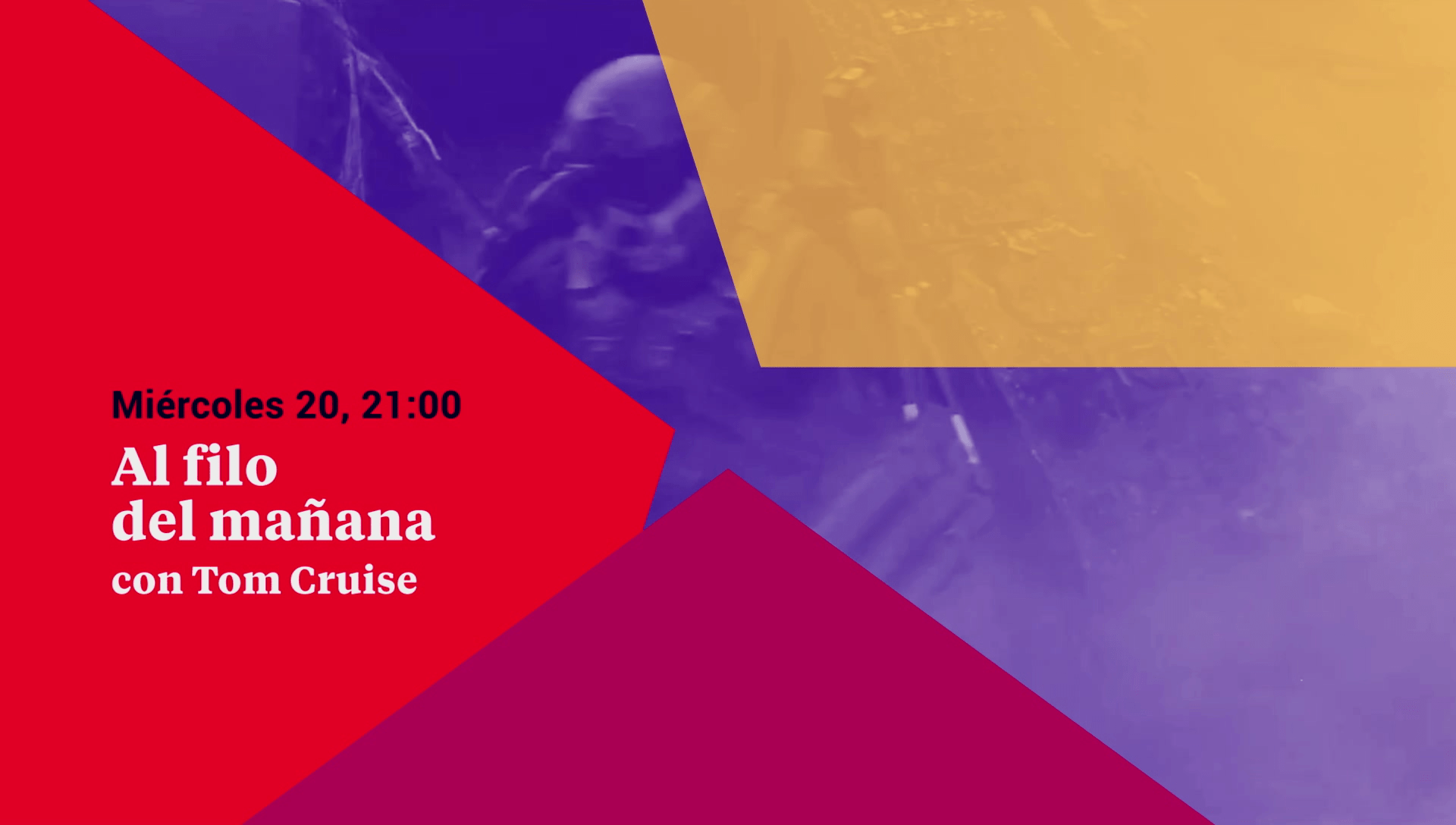
The visual language grows from the star, as the star swirls around its centre. The spaces that the vectors generate in addition to the colour blocking make for a very simple but powerful code. A very identifiable but almost infinite language.
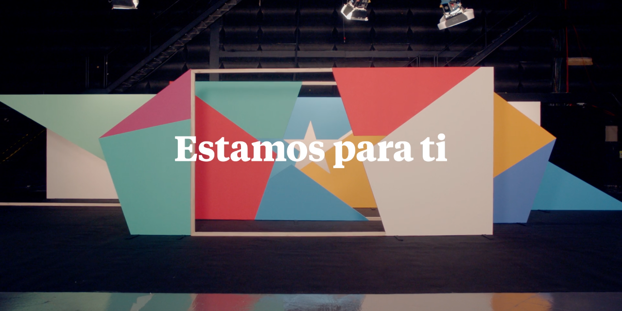
The tag line, which translates as “We are here for you”, reflects the mission of this Madrid public broadcaster: to be at the service of the citizens of the Community of Madrid.
It is also very malleable and can be used in many different ways.
TeleMadrid is now a single word but by making the M capital it creates a more iconic brand mark and gives the spotlight to Madrid.
The audio branding created by Banjo Music is a very precise sound landscape. It takes inspiration from Madrid’s Chotis and street barrel organs and brings the sound into the 21 first century making it remarkable, contemporary and warm.
That madrileños are the star of the broadcast is not only a strategic idea. The protagonists of the bumpers are real Madrileños, real places from all over Madrid, dogs, squares, plazas. Madrid is at the center of everything.