
MOVISTAR +
Branding & TV Image, FeaturedMOVISTAR +
The brief
To create a new entertainment brand for the integration of Canal+ onto the Movistar platform, bringing together the best technology and innovation from Movistar and the greatest pay per view content offering in Canal+.
We collaborated with our friends at branding agency Mucho to develop distinctive identity that would include the ethos of the two mother brands whilst keeping the viewer at the centre of the brand universe, engaging them in a multichannel digital ecosystem.
A Community
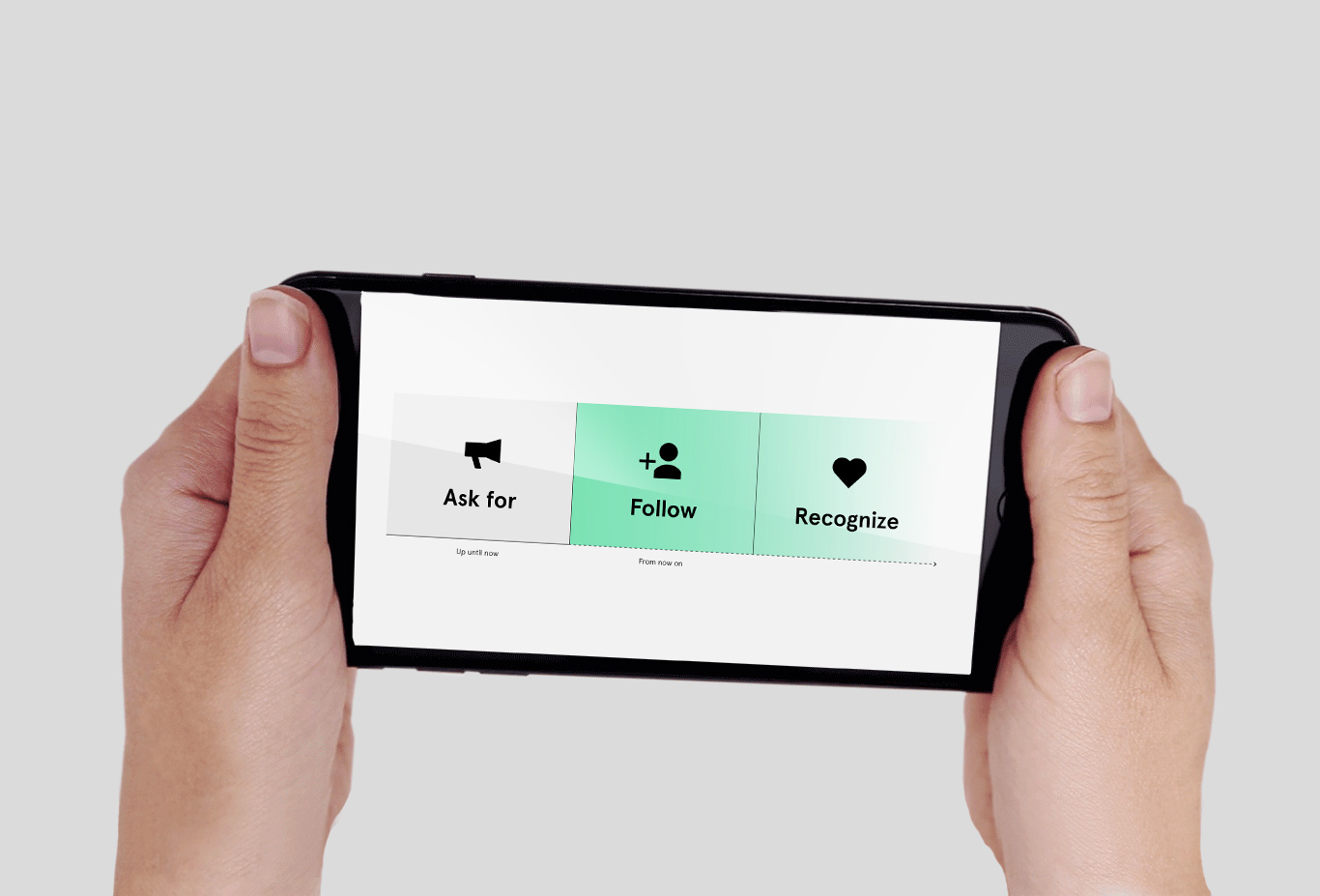
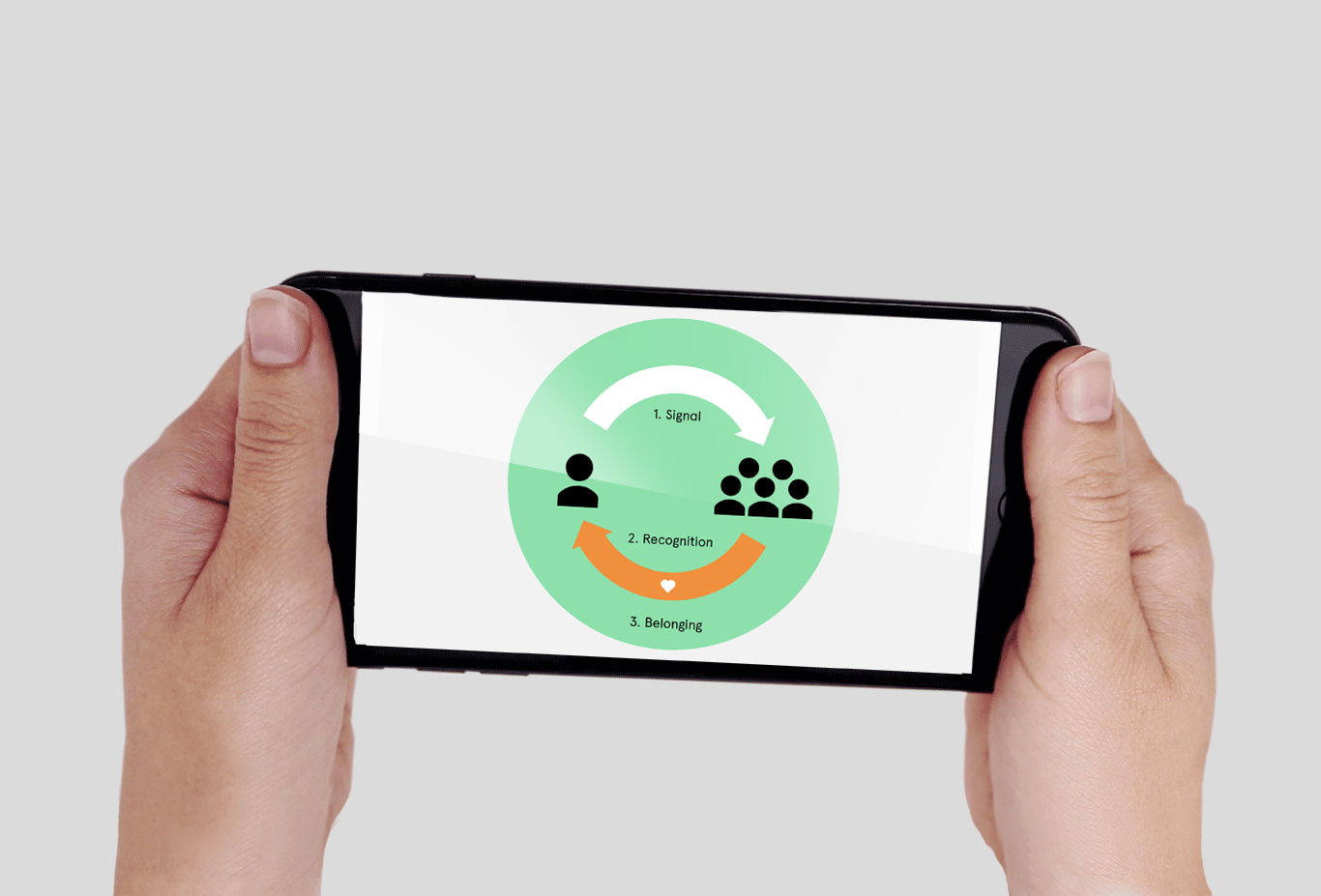
Sharing makes us human. But how could we entice the viewer to share their lifewith Movistar+? Our strategic approach began by understanding how individuals feel represented in a group and how they develop a sense of belonging. Sharing personal, individual moments and emotions with the group generates a recognition response which brings people together. The brand could no longer be passive. Movistar+had to engage with and become afollower of its audience, a super fan by coproducing content with the audience, and continuously sharingt hese creations. Sharing the viewers own creativity was the key to engaging with them and recognising their role.
By putting the viewer on tv (and across all the media in the platform), the brand became a space for community. This is the core idea behind the corporate identity.
Basic identity
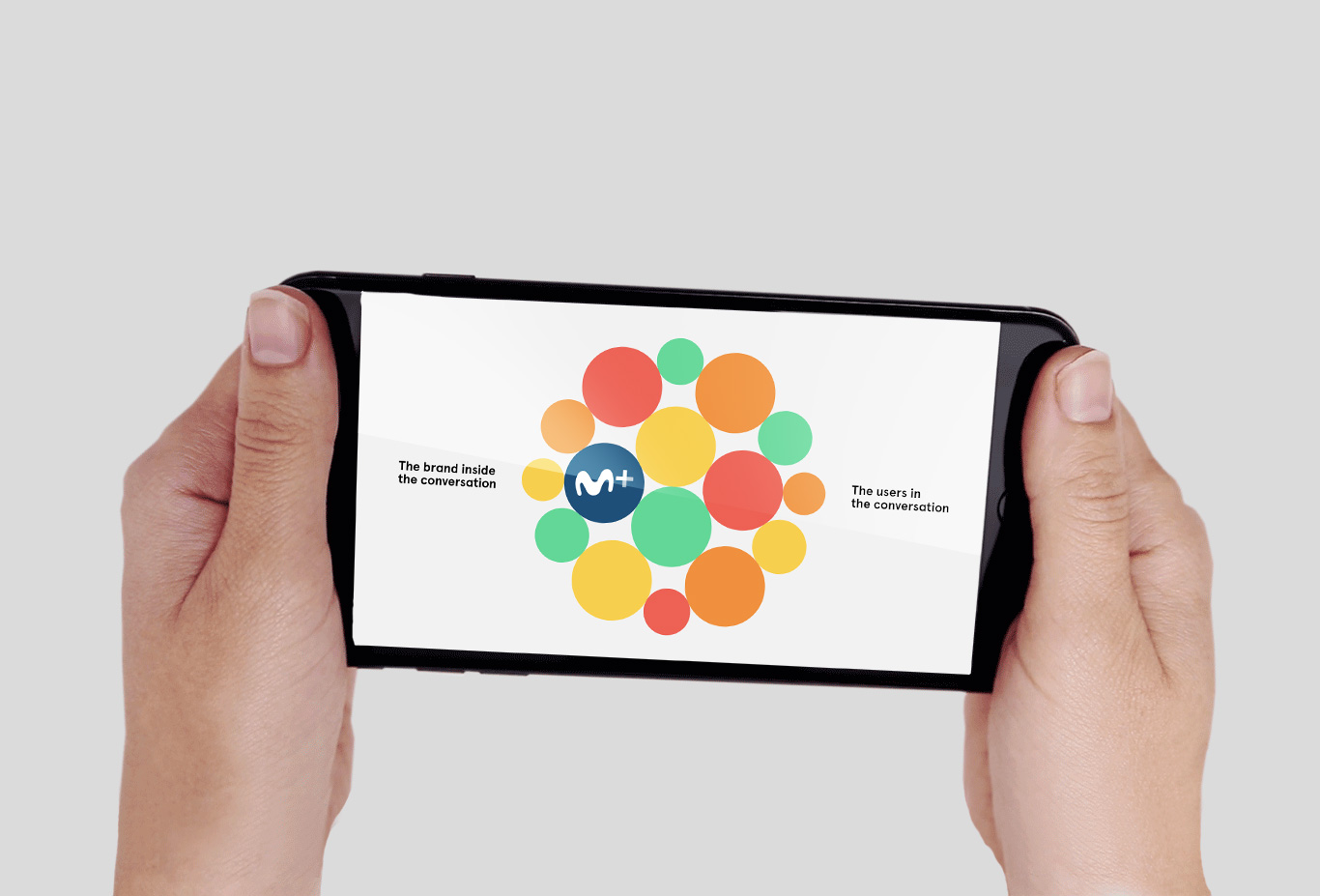
The Canal+ and MovistarTV logos come together to create the new Movistar+. The M+ symbol is a new way of representing a corporate icon. Instead of functioning as a corporate sign-off, the symbol becomes a talking avatar which embodies the brand values and engages directly with its audience in an continual conversation. The icon is the symbol of a super-follower, of a reposting multiplatform, and recognises the relationship with the viewer. With this structure in mind, we developed a consistent and organized brand architecture. Using a new corporate type face we created a corporate visual voice, which is the vehicle for the conversation. The new brand comes to life with the emotion generated by real conversation with the user and talking about the shared content, generating a creative, expressive and tight community for the brand to live in.
Graphic language
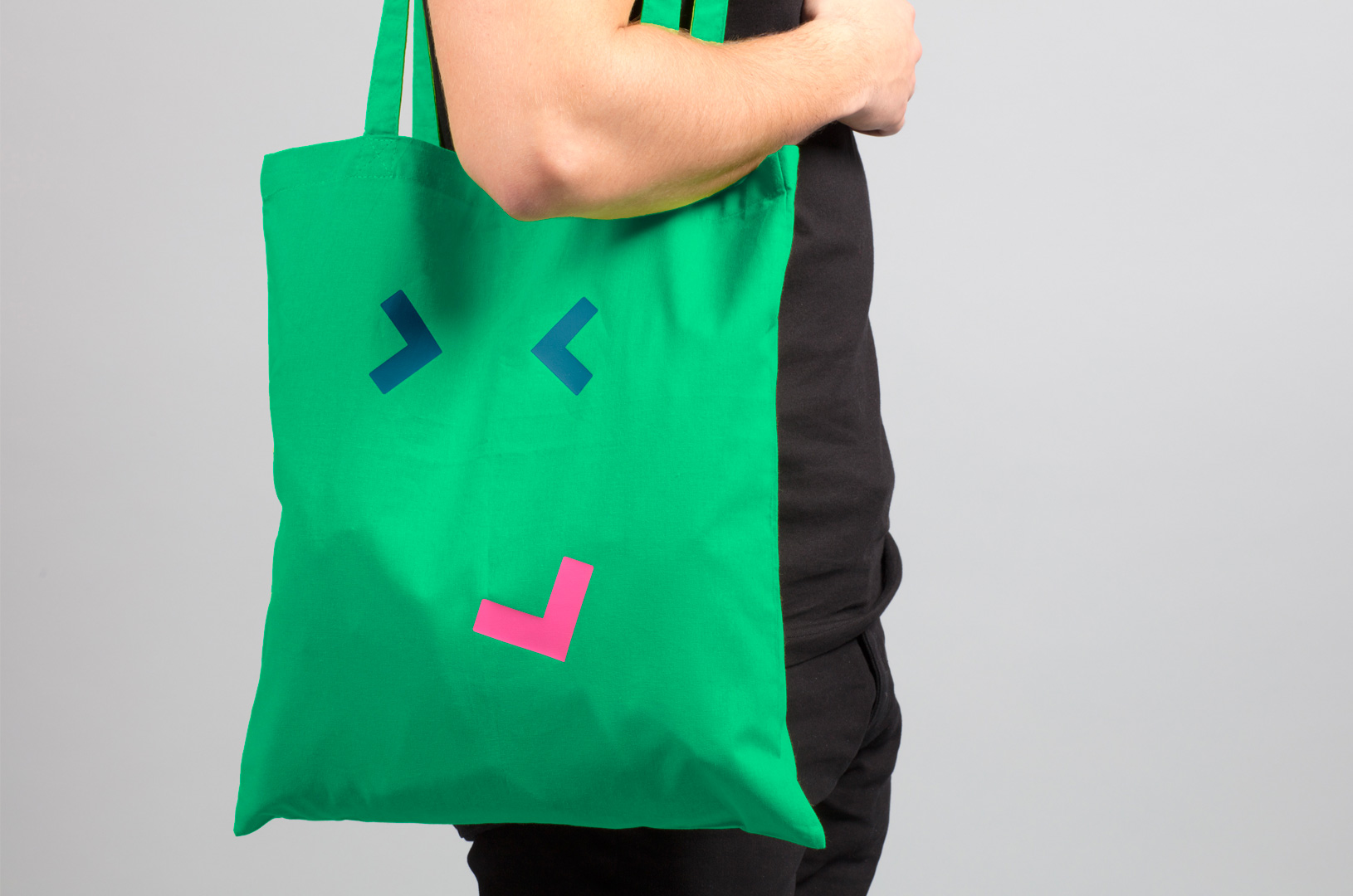
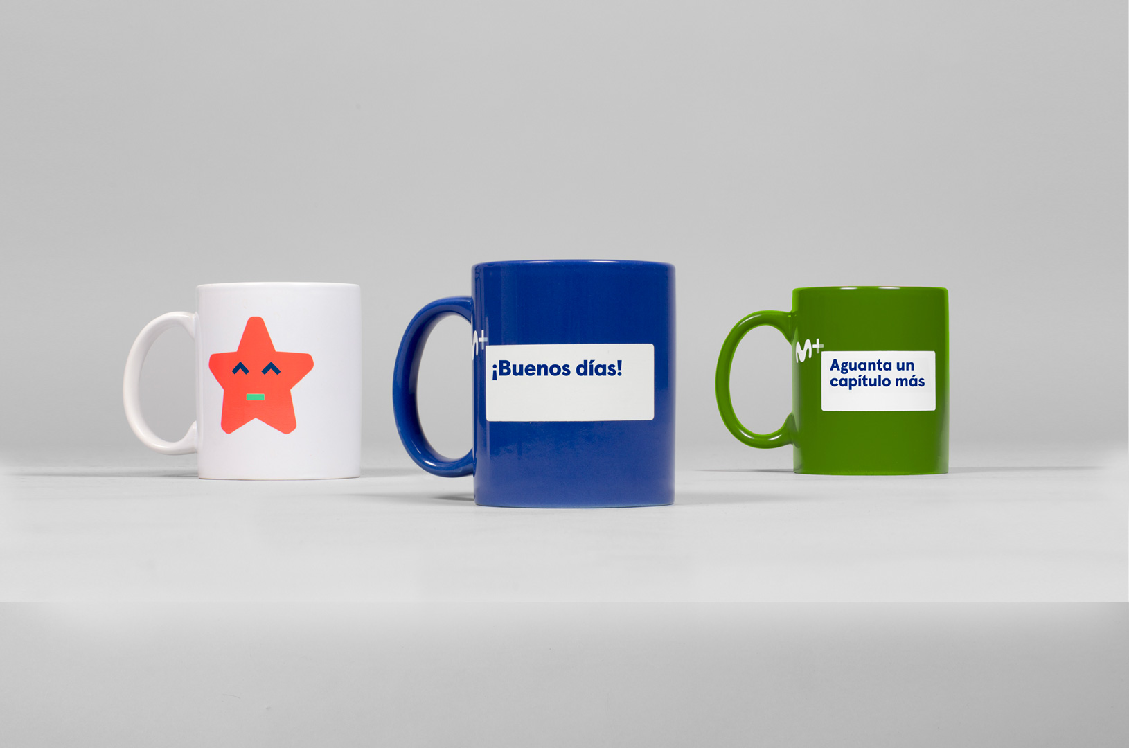
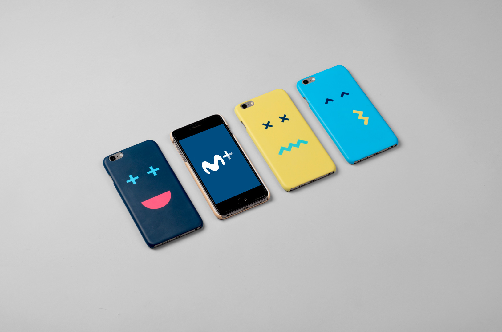
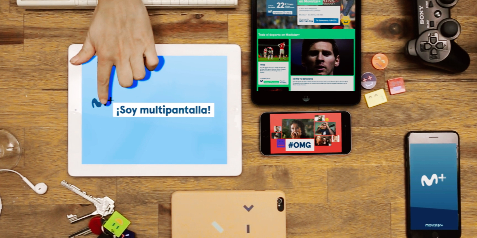
The graphic language is inspired by the multiscreen culture which surrounds us. We are always connected through different devices such as smartphones, laptops, tablets, televisions, or printed matter… The multiscreen language allows the brand to reflect this on/off reality, and also express itself through a myriad of channels. The multiscreen graphics develop a rich moving image and photographic language. By combining images in various ways produces different meanings, versions of the same stories or jokes, told in a number of different ways. Images are connected, constructed, reflected, related or antagonised making the conversation fun and entertaining, and effectively transforming the corporate identity into a layer of visual content. In addition, the ‘emovicons’ where produced based on the proportions of the ‘M+’ icon to further develop an emotional and human voice for the brand. All the graphic language elements enhance the conversation, to reinforce and connect with content produced by the viewer, making them the centre of the identity.

Application one: on-air
The new Movistar+ identity reaches its full potential on air, behaving as an expressive tv multiplatform language. The on air avatar logo comes to life with the ‘M’ acting as a visual narrator, and the ‘+’ sign becoming a cursor. The avatar sets the pace and introduces the ‘emovicons’. The multiscreen language develops into an endless canvas of scalable content boxes. The combination of these elements creates a seamless identity system, easy to use and to integrate texts, pictures and videos, with programming information and user content.
The identity pieces use social media codes, using popular internet content or the platform’s own content to generate a fun and surprising language, aimed at connecting with the viewer in a natural way. In the ids, the divide between on and offline is blurred by a series of visual metaphors. Finally the audio branding has been created as a puzzle of interchanging sounds. This generates an open system, which can grow along with the future communication needs of the platform.
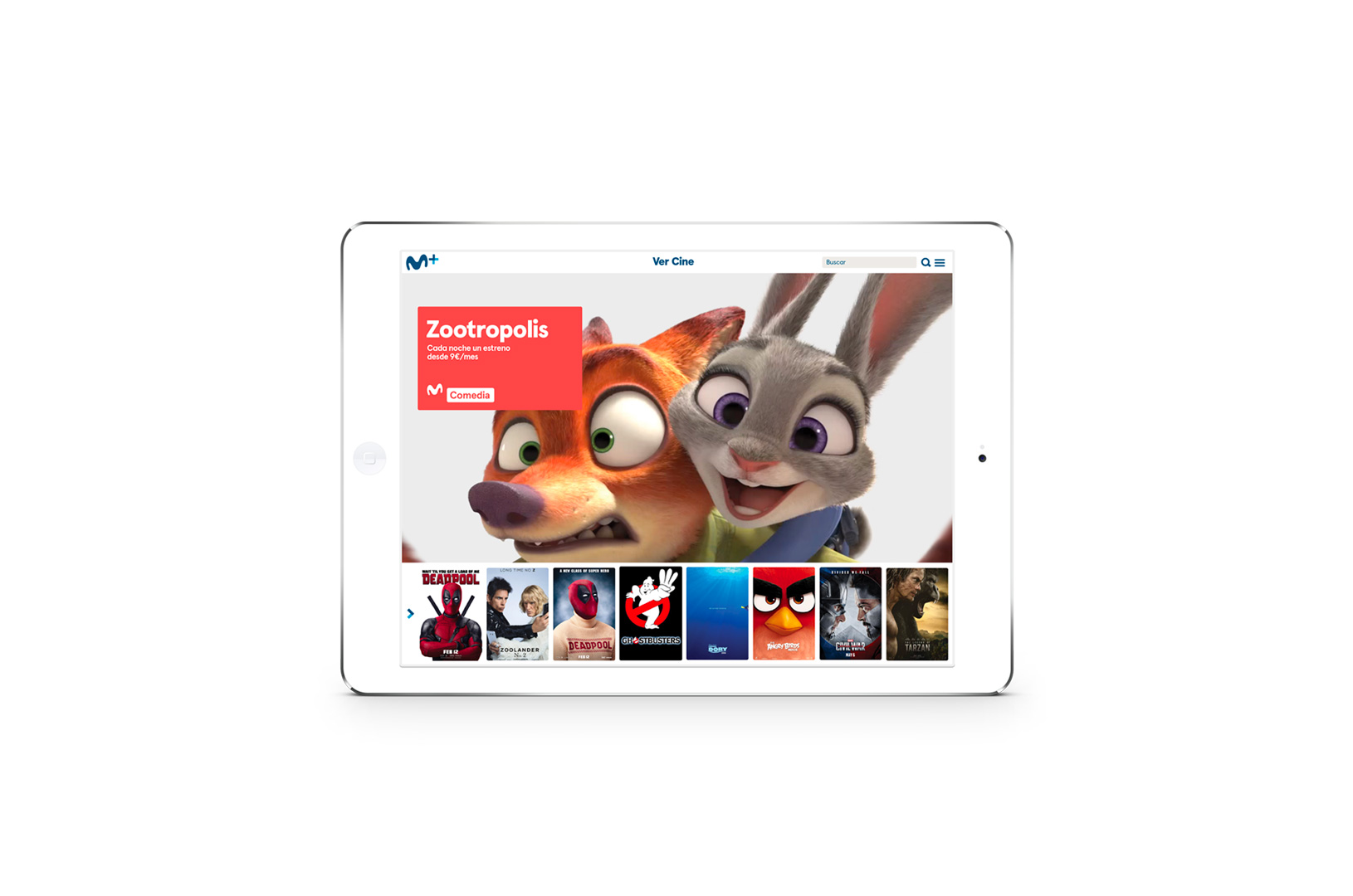
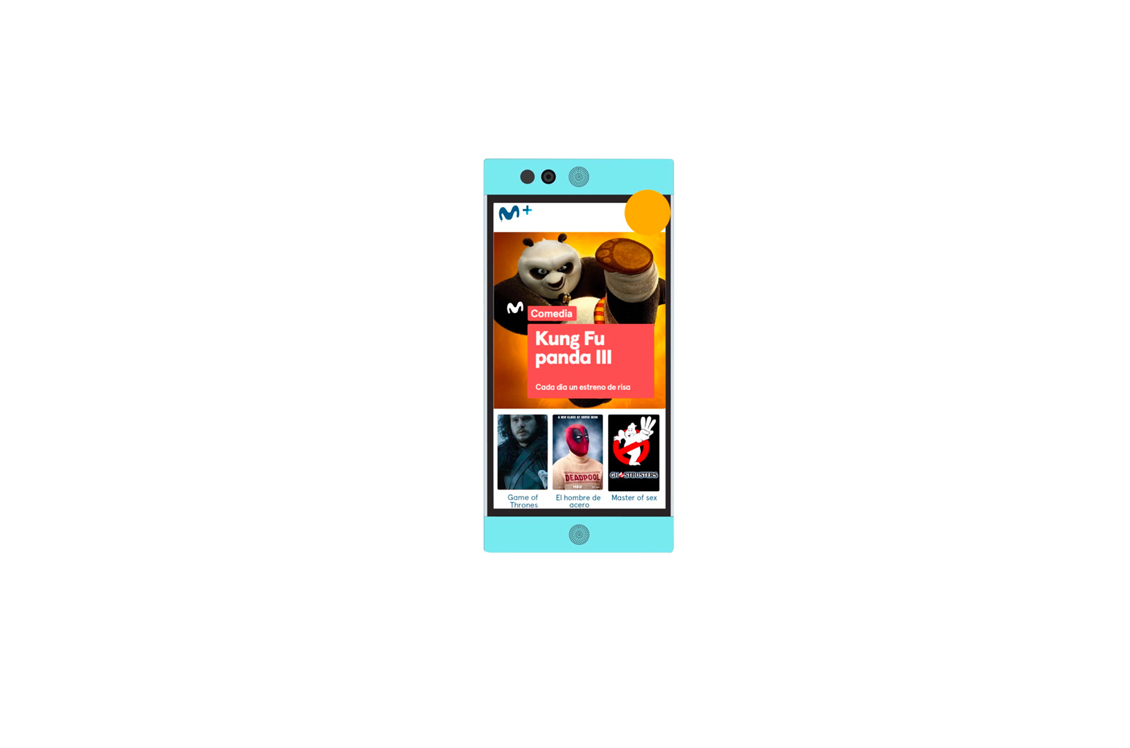
Application two: interfaces
The use of different platforms (IPTV, DTH y OTT) demanded an identity able to adapt to the needs of different environments, whilst ensuring the best navigation and user experience. This also extended on to the web and app interfaces.
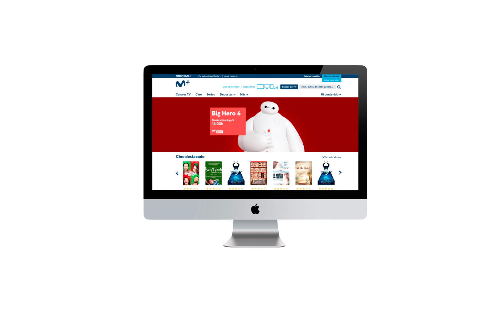
Application three: social networks and website
The Movistar+ identity was created to connect with the viewer through a sense of community and this really comes into its own in the digital and social media space. Through a system of bumpers which work simultaneously on air, online and on social media, Movistar+ follows people, generates likes, memes, comments, photos, and screenshots. And obviously the Movistar+ content is a vehicle for the stories and events of daily life, be it a new movie, the latest chapter of a series or a football match. In this way, social communication is achieved through all the channels of the multiplatform.
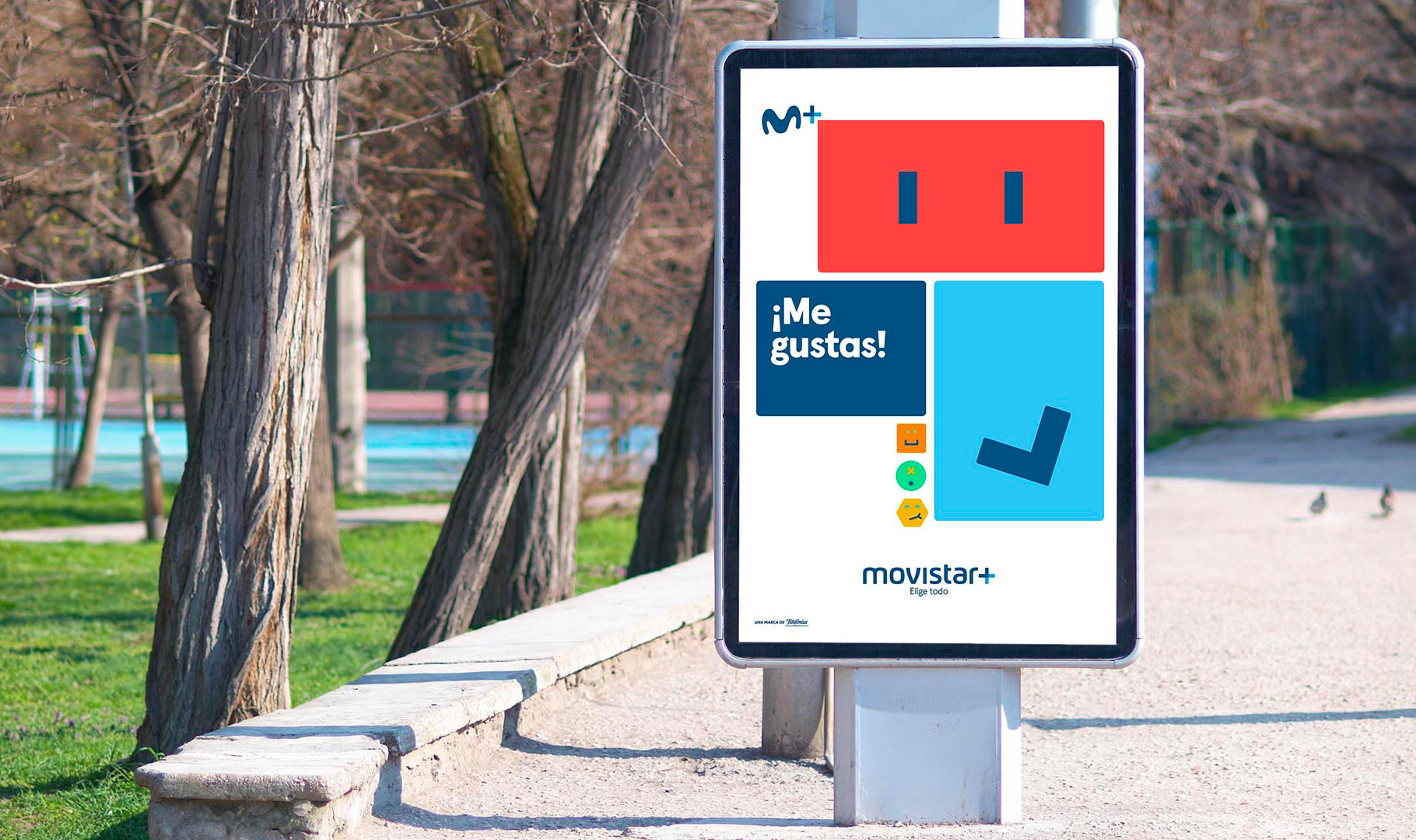
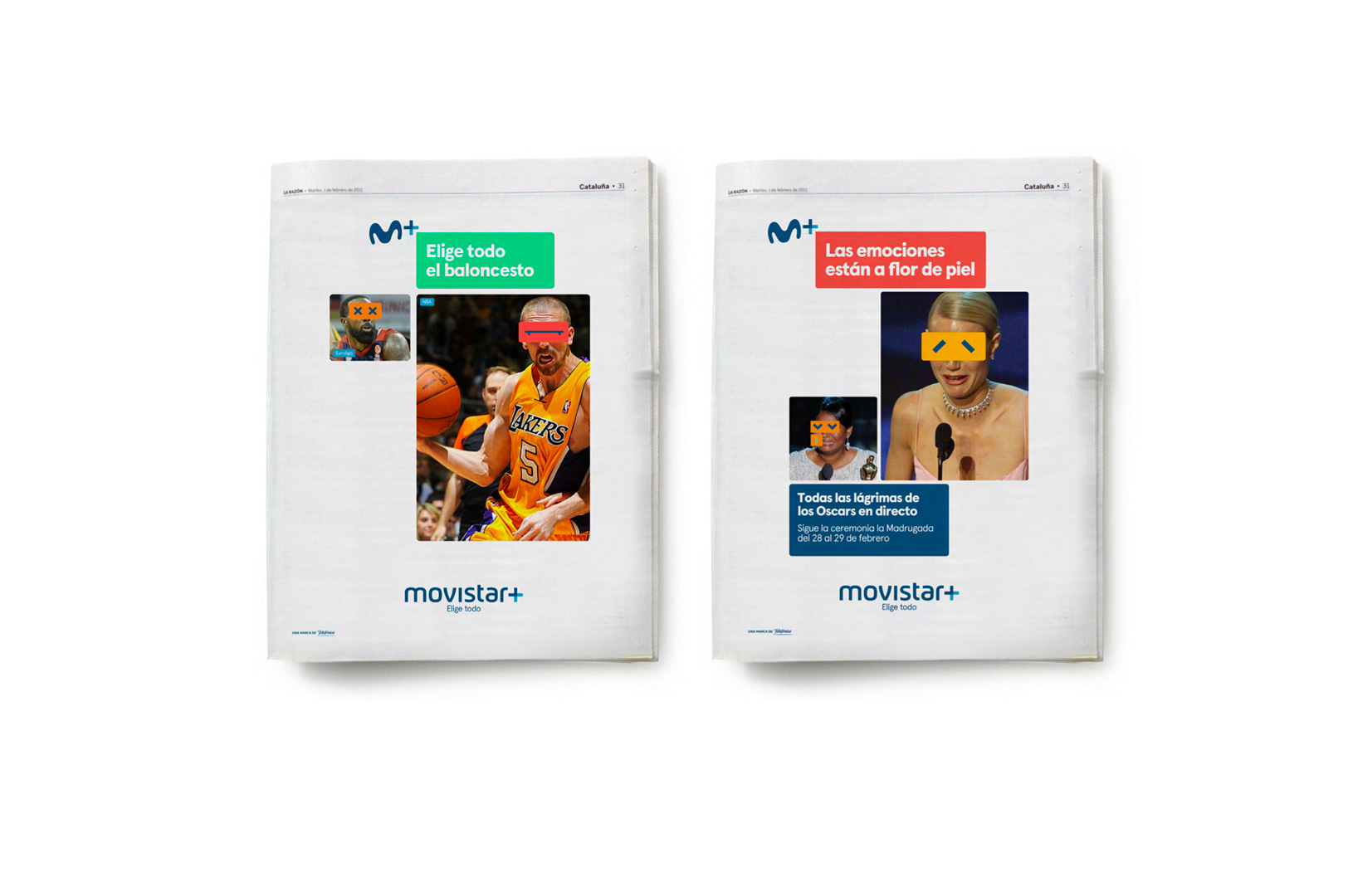
Application four: print
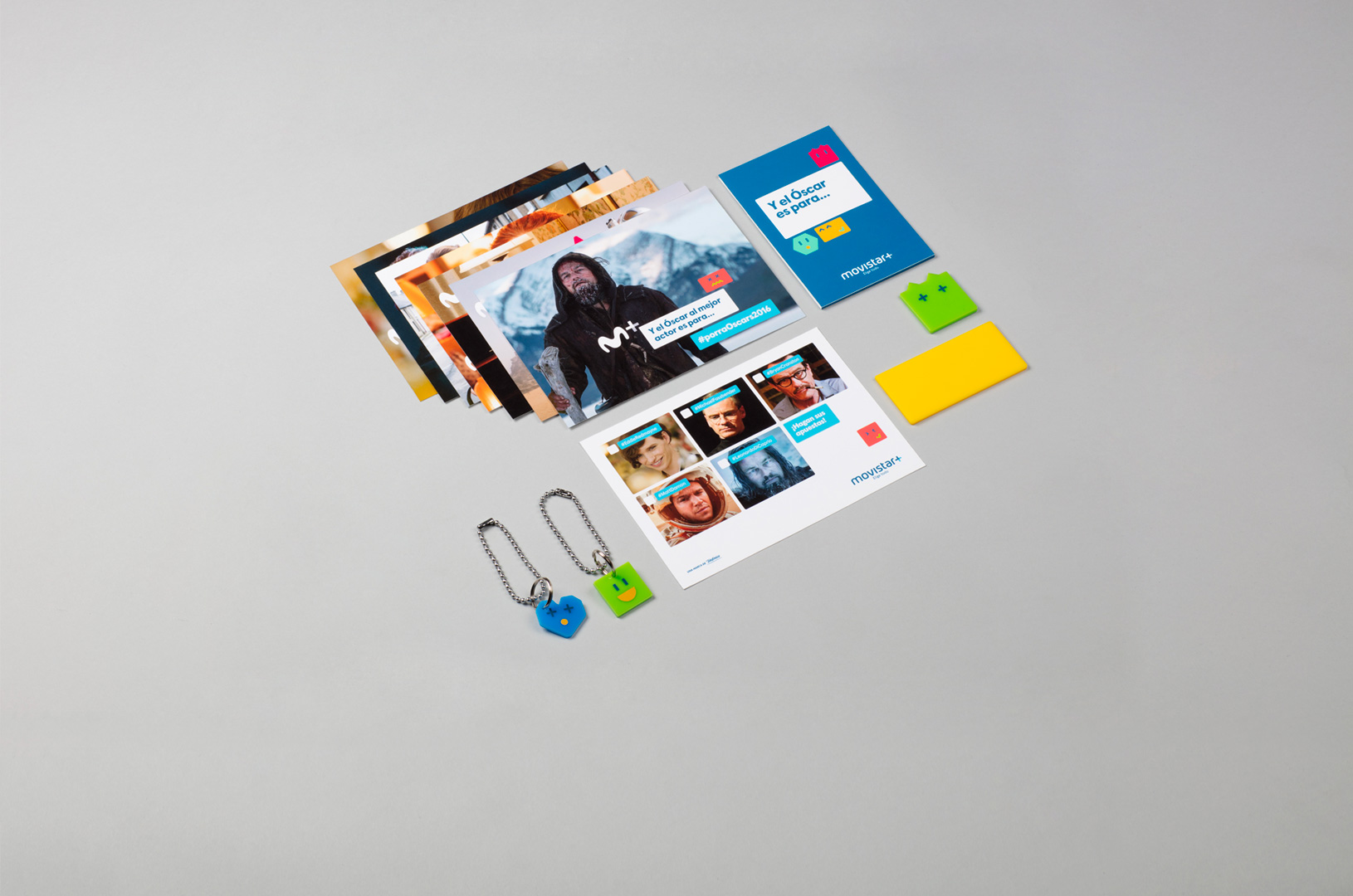
The multichannel graphic language uses its full design and photographic potential to translate the brand’s on air energy to print, making the most of each medium. Print material mixes programming communication needs with an editorial use, allowing ads and billboards to became content channels for the audience’s creativity. The ‘emovicons’ extend this community ethos through the merchandising products.